今天图老师小编给大家精心推荐个图解对称技巧在网页设计中的运用教程,一起来看看过程究竟如何进行吧!喜欢还请点个赞哦~
【 tulaoshi.com - 平面设计 】
在设计中,对称创造了平衡,平衡了创造和谐、秩序和审美。自然界中对称无处不在,也许正是这种无处不在的状态让我们发现对称的美。形态学的基本原则之一就是对称,它是一套人类形为理论,形态学认为人类对看到和遇到的事物本能的产生出秩序和完整性。
However, symmetry can get boring. Asymmetry is a break in symmetry, which when used effectively, can make things more interesting. We will also talk about asymmetry.
然而,对称也会让人感到厌倦,这时就出现了不对称。如果用的好,不对称可以营造出更有趣的效果。在这里,我也将会谈一谈不对称的用法。
How can designers use symmetry as a tool? In this guide, we’ll look into symmetry as a part of design and cover the basic concepts of symmetry, some symmetry techniques, tips and best practices, and a discussion of a few websites that embody symmetry.
设计人员如何将对称作为工具?在下面的内容中,我们将涉及设计中的对称,对称的基本概念,使用对称的技巧、秘诀和最佳案例,以及对一些使用对称设计的网站进行讨论。
Types of Symmetry
对称的种类
There are three types of symmetry: reflection (bilateral), rotational (radial), and translational symmetry. Each can be used in design to create strong points of interest and visual stability.
对称分三种:反射对称、 旋转对称、平移对称。不同方法的使用可以创造出强烈的兴趣点和视觉稳定性。
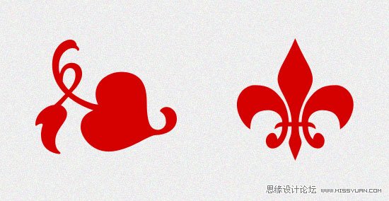
Reflection Symmetry
反射对称
Reflection symmetry is also known as bilateral symmetry. It is the "mirror" effect, or when one object is reflected across a plane to create another instance of itself.
反射对称也叫做左右对称。反射对称就是一种镜子效映,一个物体在平面内反射后得到另一个自已。
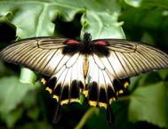
The most common type of reflection we think of, and the most common we see in nature, is horizontal reflection (a butterfly, the human body), with the central axis being vertical.
自然界是最普遍的反射是水平反射,如:蝴蝶、人体,中心轴是垂直的。
Reflection symmetry can take on any direction: vertical, diagonal, and anything in between.
反射对称可以是任意方向的,垂直的,对角线的,或是界于这两者之间的任一角度。
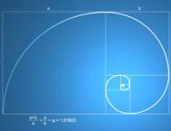
Rotational Symmetry
旋转对称
Rotational symmetry (or radial symmetry) is when an object is rotated in a certain direction around a point.
旋转对称(或称放射对称)是指某一物体绕着某一点在某一方向上做转动。
Rotational symmetry in nature is found in everything from the petals of a flower to the topside view of a jellyfish. In art and design, rotational symmetry can be used to portray motion or speed. Even on a static medium, rotational symmetry can convey action.
在自然界中,从花瓣到水母的顶部视角图,随处可以发现转动对称的存在。在艺术和设计中,转动对称可以用来表达动作和速度。即使在一个静态的介质中,转动对称也可以表达出动态的意味。
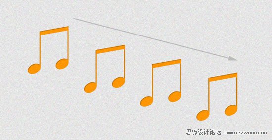
Translational Symmetry
平移对称
Translational symmetry is when an object is relocated to another position while maintaining its general or exact orientation. In the example below, we’ve moved one object several times at even intervals. These intervals do not have to be equal in order to maintain translational symmetry; they just need to be proportional.
平移对称,是将一个物体移动到另外一个位置,物体大体的方向不变。如下图,物体以相等的间隔移动了若干次。平移对称的称动间隔不一定是相等的,只需要成比例移动。
Translational symmetry can be used to create patterns, such as in the case of tiled website backgrounds and repeating design elements. It can also be used strategically and more profoundly to create the feeling of motion and speed just like rotational symmetry.
平称对称可用来制作各种图案,例如平铺的网站背景和重复的设计元素。如果运用的好,平移对称完全可以像转动对称一样打造出运动和速度效果。
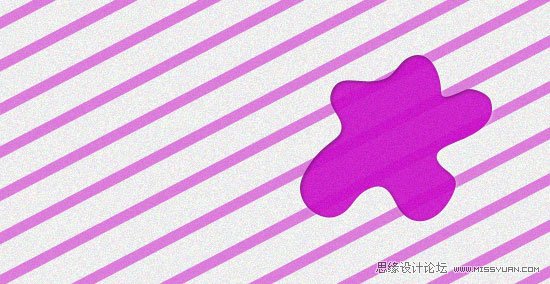
Asymmetry
不对称
Asymmetry is the lack of symmetry. Asymmetry can also represent an object that breaks a predefined pattern of symmetry, or an imbalance of design elements.
不对称即是对称的缺失。不对称打破了预先的对称模式,是设计中不协调的元素。
Asymmetry can be used as a design tool to create points of interest and organize visual hierarchy within a group of similar elements. It creates disorder, which can call attention to certain points of a design through distinction.
不对称的使用可以创造出不同的兴趣点,在一组相似的元素中建立视觉层级。不对称创造出无秩序的效果从而突出设计。
In nature, we can see asymmetry in tree branches, in clouds, and in the fur of animals.
自然界中,树木的枝杈,云朵,和动物的皮毛都是不对称的体现。
We may find asymmetry appealing because of its ability to introduce visual complexity and variations to an otherwise orderly design.
不对称具有很强的吸引力,因为它可以在统一的设计中营造出视觉的复杂性和多样性。
Asymmetry vs. Symmetry
不对称 vs. 对称
An asymmetrical object is visually heavier than symmetrical objects. Therefore, symmetry is great for patterns, backgrounds, the general layout, content, and anything else that is meant to be visually passive. Asymmetry is effective in drawing attention and breaking monotony.
不对称物体在视觉上要重于对称物体。因此,对称最适合用在图案、背景、总体布局、内容及一切视觉上被动的设计中。而不对称可以抓人眼球,打破千篇一律。
Symmetry/Asymmetry Design Tips and Best Practices
对称/不对称设计技巧和最佳案例
When working with symmetry (or asymmetry) in design, there are several best practices you should keep in mind.
在使用对称或不对称做设计时,以下最佳案例可以用来参考。
Use Symmetry Strategically
适当的使用对称
Strategic use of symmetry (and the lack of it) is a powerful design tool. Designs that need more stability, a strong organizational structure, and a classic and trusting message, tend to use more symmetry in the design.
(本文来源于图老师网站,更多请访问https://www.tulaoshi.com/pmsj/)合适的使用对称是一个强大的设计法宝。以下情形中更趋向使用对称,如:需要更大稳定性的设计中,牢固的组织结构中,或是要传递传统的、令人信赖的信息时。
For risk-loving designs, providing asymmetry can reinforce the message. You can use asymmetry to punctuate an otherwise orderly, boring design.
对于一些大胆、创新的设计,不对称更可以强化这种效果。不对称可以使平淡的设计出彩。
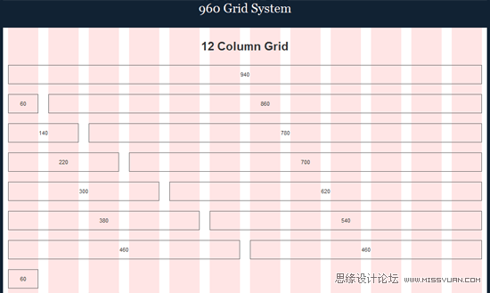
Translational Symmetry is Good for Layout Structure
平移对称最适合用于结构布局
Keeping pieces of content roughly the same size and spanning them across a web page or print piece is a great way to keep symmetry while maintaining enough space for all of the essential text and imagery.
将内容条块设置成大约相同的尺寸,扩展至整个页面,或者输出内容条块是实现对称的最好方法,同时也可以为主要文本和图像留有足够的空间。
For example, many grid layout systems (such as the 960 Grid System) exhibit translational symmetry in the way they break up column widths to maintain balance and proportion.
例如,许多网格布局系统通过打破列宽来展示平移对称,以保持平衡和比例。
Use Rotational Symmetry to Convey Movement and Action
使用旋转对称传达动作和行为
Rotational symmetry can simulate motion even in an otherwise flat and static medium. It can also infer progress or forward movement.
即使在平面静态的介质中,旋转对称也可以模拟运动。旋转对称可以推断发展进程和向前运动的方向。
Use Asymmetry to Draw Attention
利用不对称突出重点
Asymmetry can make designs more interesting overall, but it serves another primary purpose: to grab attention and create visual hierarchy. Sometimes a design can intentionally be thrown off balance to direct the viewer’s eyes to a certain area.
总的来说,不对称可以让设计更有趣,但其另有更基本的功能:抓人眼球和营造视觉层级。有时设计者故意打破平衡以将用户的注意力引导到某个区域。
Follow Your Gut Instinct
跟着感觉走
Symmetry is natural. If you know of Gestalt principles, then you’ll no doubt already know that our brains are wired to create symmetry and balance in the things we encounter. Our bodies have natural symmetry. Symmetry is in nature and is all around us.
对称是与生俱来的。如果你熟悉格式塔原理,你必定知道人类的大脑对遇到的事物本能产生对称和平衡。我们的身体生来就是对称的,对称在自然界中,对称就在我们周围。
If something looks and feels unbalanced, it probably is.
然而如果什么东西看起来或感觉起来是不平衡的,这种现象也许是存在的。
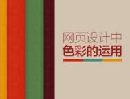
Symmetry in Web Design: Examples
案例:网页设计中的对称
Below you’ll find 15 examples of how symmetry and asymmetry are used in designs. From the use of symmetry, we can see how each design portrays a certain message, with those designs that have more symmetry being more calming and organized, while those with more asymmetry tend to be more unconventional and organic.
下面的15个案例中,你将学到对称和不对称是如何使用的。通过对称的使用,我们能够了解到各种设计是如何传递特定的信息:使用大量对称手法的设计看起来更深沉,更有条理;而不对称的大量运用感觉更个性化。
IWC
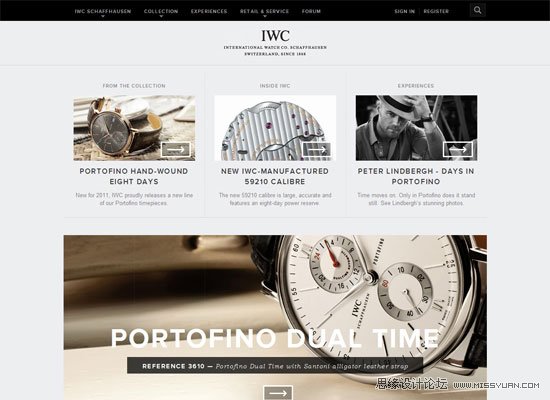
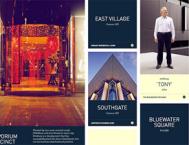
In the IWC website, we see both translational and reflection symmetry. Many elements and blocks of content are centered and are evenly proportional on both sides to create reflection symmetry, and we can see how sections of content are kept to the same size and then translated across the page. With the use of these two forms of symmetry throughout the entire design, this website has a very stable and professional look.
在IWC的网站中,使用了平移对称和反射对称。许多内容元素和内容块居中,并且均匀地成比例的分布在两边形成反射对称。每一块区域保持相同的尺寸扩展至整个页面。整个设计中两种对称方法的运用,使网站看起来即沉稳又专业。
Regenerator
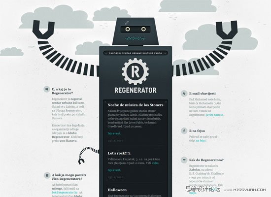
Regenerator is a great example of reflective symmetry in web design. Everything from the logo to the central piece (an illustration of a robot) is reflected horizontally. This fairly simple solution creates a great design.
Regenerator是网站设计中使用反射对称的极佳的例子。所有设计元素,从logo到中心位置的图像(机器人图像)全部水平反射。这种相当简洁的设计方案却呈现出极好的效果。
Beanstalk
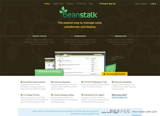
For the most part, this design remains centered and creates a horizontally symmetrical look. Although the imagery is not an exact reflection, the overarching balance of the design is. We also see content elements located at the top and bottom of the layout shifted (translated) horizontally across the page for further symmetry.
总的来说,此设计保持居中并水平对称。虽然图像元素并不是完全的反射,但整体设计的平衡却达到了这个效果。页面顶部和底部的元素布局呈水平变换,达到了更深层次的对称的效果。
Pointless Corp
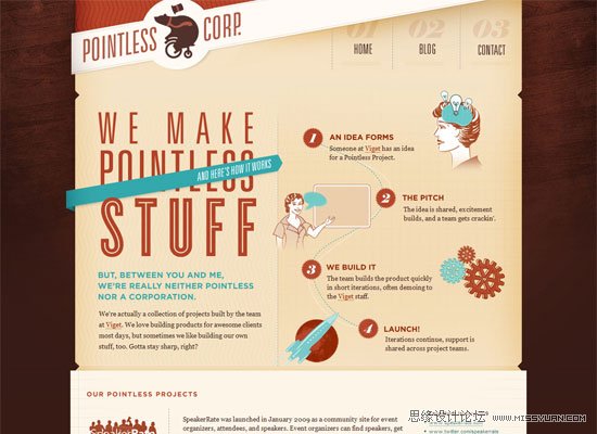
Pointless Corp has a very asymmetrical design, which makes it creative, whimsical, and visually appealing (although there is also symmetry involved to help keep the design cohesive). Note how some shapes and directional flow are repeated (a manifestation of translational symmetry).
这个页面使用不对称的设计手法。此种风格使页面看起来富有创意、天马行空、视觉上有很大的冲击力(同时也使用对称手法以保持设计的一致性)。要学习各种形状和流程的重复使用(这是平移对称的展现)。
The Idealists
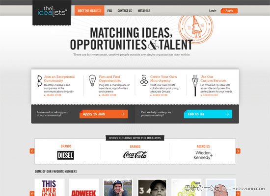
We can see both translational symmetry between the shape and size of content blocks, and reflection symmetry from the main elements centered and evenly spaced across a vertical plane in this web design. This design, however, does a bit more by adding some interest with overflowing elements such as the logo and imagery. Note that even though these two design elements (and a few more throughout the site) add visual interest, they still balance each other out to maintain symmetry in the design. The logo on the left is darker and overlapping, but it is balanced by the more complex and brighter image to the right of the tagline.
可以看到,各个形状间和内容区块间均使用了平移对称。主要元素采用居中反射对称,并均匀地垂直分布于整个页面。需要学习的是,虽然个别的几个设计元素增强了视觉效果,但在设计上它们依然保持对称以达到平衡。页面左上角的黑色logo是覆盖上去的,为了达到视觉的平衡,右侧的图片采用更为复杂和色彩明亮的图像。
Typographisme
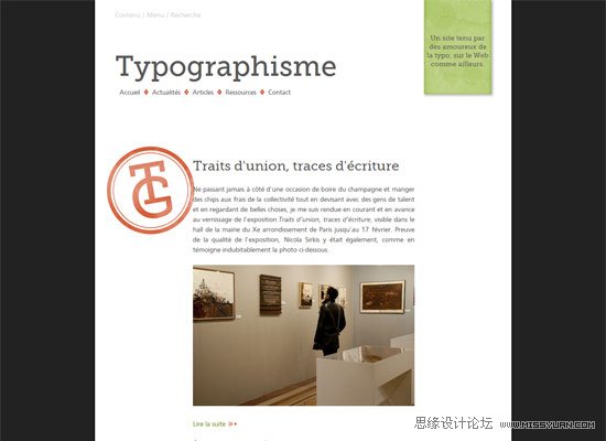
This web design uses reflection symmetry. The main content is evenly centered, and would match up on either side if folded in half. However, we can also see that there are plenty of asymmetrical elements, employing them to create visual hierarchy and distinction in certain areas of the design. The orange "TG" stamp, for example, serves to punctuate the monotonous symmetry.
这个网站设计采用反射对称,主要内容均匀的居中对齐。如果将页面对折,两边会相互吻合。除此之外,不对称元素的使用更是创造了视觉层次,用以区分其它部分。例如,黄色TG邮戳状图像,就打破了单调的对称设计。
Coda Automotive
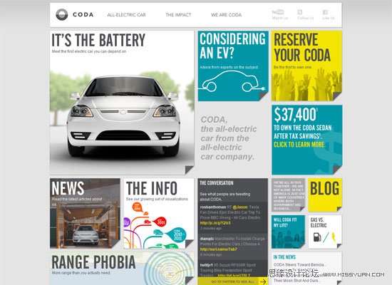
Coda Automotive is a content-heavy site, which means balance and organization is essential to site usability. We can witness a lot of translation symmetry in this design, where the same-sized block shape is repeated in various locations. For interest and likely due to practical content-related layout purposes as well the shapes of the squares also vary in size, yet still maintain visual balance on either side by mixing up size versus complexity, color, and density.
这个网站内容很多,因此平衡性和组织性是至关重要的。页面中大量使用了平移对称设计,相同大小的形状重复出现在不同的位置。为了强化视觉,也为了实用性的内容布局,各个方块在尺寸上也不尽相同。不同尺寸、不同复杂度、不同颜色和密度的方块混合,达到视觉的平衡。
Jessica Allen

This web portfolio is likely the most asymmetrical design in this showcase. There are a few areas of translational symmetry, and the logo provides perfect reflection symmetry, but beyond that, not much else. As you can see, asymmetry is equally effective as a design tool.
在这个案例中,大量使用了不对称的设计。除了一小部分使用平移对称,logo使用了反射对称之外,全部采用不对称手法。正如我们所看到的,不对称同样是一种高效的设计方法。
Ambassadors for Life
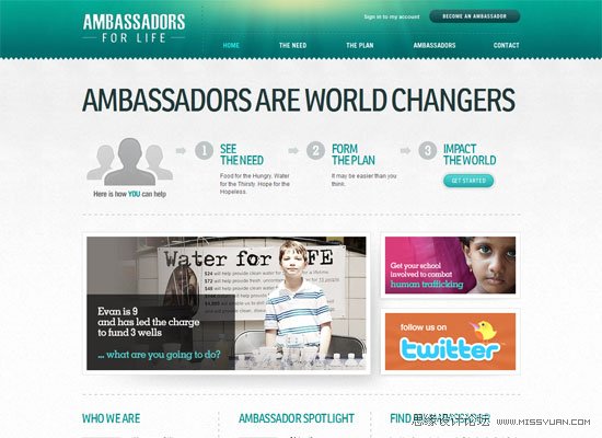
Here again we see a lot of translational symmetry in the content, from the size of the content blocks to the additional imagery surrounding those blocks. There is some reflection symmetry present in the logo, as well as in the image directly below it. What keeps this design interesting is the jarring asymmetry in the main photos below the "process" content, helping draw focus to the site’s featured story.
在这里,内容上同样采用了大量的平移对称,从内容块的尺寸到内容块周围的附加图像。页面logo和logo下方的图形采用了反射对称。这个设计中最有意思的是主体的照片部分,主体照片大小不一,引导用户关注网站的专题报道。
QTRLY

The background and main navigation menu of QTRLY are abstract. However, the main featured pieces of content are repetitive blocks, translated horizontally and vertically for balance and structural integrity.
这个网站的背景和导航菜单采用抽象设计。而主体部分是方块的重复使用,为了达到平衡与结构的完整水平垂直重复。
Elegant Seagulls
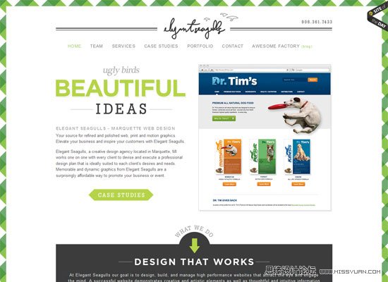
The Elegant Seagulls website is a symmetrical design. The logo, tagline, and navigation are all centered, as are many other header elements. The listed section of services towards the bottom of the layout also displays translational symmetry.
这是个对称设计的案例。logo、装饰条、导航以及许多标题元素居中展示。底部的服务列表采用移动对称设计。
(本文来源于图老师网站,更多请访问https://www.tulaoshi.com/pmsj/)Dark Sky
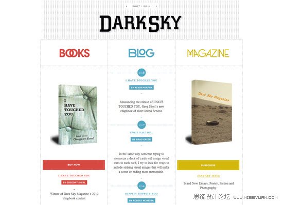
This web design is clean and simple, but embodies a grid layout that maintains translational and reflective symmetry. Where there is a book image on one side, there is another one at the opposite of it.
这个网页设计干净、简洁,采用网格布局区分出平移对称和反射对称。左右两边均有书籍图片保持对称。
Polecat
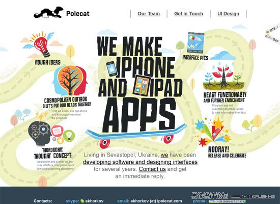
Polecat features rotational symmetry put to use in web design. There is a general use of rotational symmetry up top around the list of features, but also a more concrete use down below by the "Our Team" section. Beyond this, there’s asymmetry going on in the background, while the main elements of content retain balance. This is a great mixture of using visual interest created by asymmetry, with balance, proportion and organization made with strategic symmetry.
这是一个使用旋转对称的案例。在页面上部特性的描述上采用了一般性的旋转对称,下面我们的团队一栏中,实实在在的采用旋转对称。除此之外,虽然页面背景采用不对称设计,主要栏目设置却保持平衡。这个页面是不对称和对称的完美融合,是视觉趣味与平衡、比例与整体性的完美搭配。
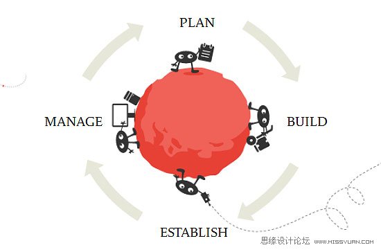
SVN 2 FTP
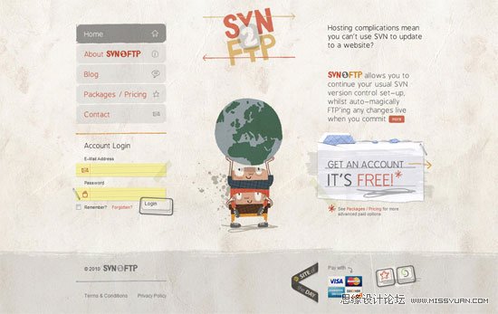
The general layout and imagery of this entire design features reflection symmetry, yet each element individually holds a lot of uniqueness and lack of symmetry. For example, the image of the two characters holding up the Earth graphic is relatively symmetrical, yet has details that would not allow it to line up perfectly. This creates just enough balance and stability, while at the same time preserving uniqueness and creativity.
这个页面的整体布局和图像设计特点是反射对称。然而单独来看,每个元素又是独一无二的,不对称的。例如:两个小人举起地球的图片相对来说是对称的,但是细节上又不完全一致。这种设计在达到平衡性和稳定性的同时,又能保持其独特性和创造性。
Forever Heavy

Forever Heavy is another mainly centered design, with its design components more or less centered and reflected horizontally. However, note how asymmetrical items are used to punctuate the general symmetry the layout has.
这又是一个以居中为主的设计,页面元素居中并水平反射。我们要学习的是,如何使用不对称的元素让整体性对称布局更出彩。
Summary
小结:
Symmetry (or lack thereof) can be a very strong tool in design projects. It can create or maintain balance, calmness, and stability. It can communicate integrity, professionalism, and solidarity. Asymmetry, on the other hand, can develop strong points of interest, uniqueness, and character. Using symmetry and asymmetry in their various forms can do a lot for our designs.
对称是设计中非常有用的一种工具。对称设计传达出页面的平衡、安静和稳定,同时表达了完整性、专业性和一致性。不对称可以营造强烈的兴趣点,显示独特和个性。总之,对称和不对称的运用能够帮助设计者设计出更完美的作品。
来源:https://www.tulaoshi.com/n/20160217/1578032.html
看过《图解对称技巧在网页设计中的运用》的人还看了以下文章 更多>>