今天图老师小编要向大家分享个CSS3实例教程:详解Media Queries片段教程,过程简单易学,相信聪明的你一定能轻松get!
【 tulaoshi.com - 平面设计 】
Responsive设计在现代Web设计中可谓是越来越流行,但很同学们并未理解其真正的设计概念,往往把Responsive视为一种自适应布局。当然有很多同学也在尝试动写Responsive的案例,但如何取其断点左右纠结,如何设置哪几个断点?又从何入手?
Responsive中的断点都依赖于CSS3的Media Queries来决断。曾在CSS3 Media Queries模板、使用em单位创建CSS3的Media Queries和iPads和iPones的Media Queries有过这方面的介绍。今天特意根据一些Responsive框架整理了一些常见的Media Queries片段,以供大家参考:
CSS3 Media Queries片段在这里主要分成三类:移动端、PC端以及一些常见的响应式框架的Media Queries片段。
移动端Media Queries片段iPhone5@media screen and (device-aspect-ratio: 40/71) {}或者:@media screen and (device-width: 320px) and (device-height: 568px) and (-webkit-device-pixel-ratio: 2){}iPhone 5 In Portrait & Landscape@media only screenand (min-device-width : 320px)and (max-device-width : 568px){// CSS Style}iPhone 5 In Landscape@media only screenand (min-device-width : 320px)and (max-device-width : 568px)and (orientation : landscape){// CSS Style}iPhone 5 In Portrait@media only screenand (min-device-width : 320px)and (max-device-width : 568px)and (orientation : portrait){// CSS Style}iPone4@media only screen and (-webkit-min-device-pixel-ratio : 1.5), only screen and (min-device-pixel-ratio : 1.5) {}iPhone 3G@media screen and (device-width: 320px) and (device-height: 480px) and (-webkit-device-pixel-ratio: 1){}iPhone/*Landscape*/@media screen and (max-device-width: 480px) {}/*Portrait*/@media screen and (max-device-width: 320px) {}Blackberry Torch@media screen and (max-device-width: 480px) {}Samsung S3@media only screen and (-webkit-device-pixel-ratio: 2) {}Google Nexus 7@media screen and (device-width: 600px) and (device-height: 905px) and (-webkit-min-device-pixel-ratio: 1.331) and (-webkit-max-device-pixel-ratio: 1.332) {}Samsung Galaxy S3@media only screen and (-webkit-device-pixel-ratio: 2) {}Samsung Galaxy S2@media screen and (device-width: 320px) and (device-height: 533px) and (-webkit-device-pixel-ratio: 1.5) {}Galaxy Tab 10.1/*Landscape*/@media (max-device-width: 1280px) and (orientation: landscape) {}/*Portrait*/@media (max-device-width: 800px) and (orientation: portrait) {}iPad In Portrait & Landscape@media only screenand (min-device-width : 768px)and (max-device-width : 1024px){// CSS Styles}iPad In Landscape@media only screenand (min-device-width : 768px)and (max-device-width : 1024px)and (orientation : landscape){// CSS Styles}iPad In Portrait@media only screenand (min-device-width : 768px)and (max-device-width : 1024px)and (orientation : portrait){// CSS Styles}Retina iPad In Portrait & Landscape@media only screenand (min-device-width : 768px)and (max-device-width : 1024px)and (-webkit-min-device-pixel-ratio: 2){// CSS Styles}Retina iPad in landscape@media only screenand (min-device-width : 768px)and (max-device-width : 1024px)and (orientation : landscape)and (-webkit-min-device-pixel-ratio: 2){// CSS Styles}Retina iPad in portrait@media only screenand (min-device-width : 768px)and (max-device-width : 1024px)and (orientation : portrait)and (-webkit-min-device-pixel-ratio: 2){// CSS Styles}iPad Mini In Portrait & Landscape@media only screenand (min-device-width : 768px)and (max-device-width : 1024px)and (-webkit-min-device-pixel-ratio: 1){// CSS Style}iPad Mini In Landscape@media only screenand (min-device-width : 768px)and (max-device-width : 1024px)and (orientation : landscape)and (-webkit-min-device-pixel-ratio: 1){// CSS Style}iPad Mini In Portrait@media only screenand (min-device-width : 768px)and (max-device-width : 1024px)and (orientation : portrait)and (-webkit-min-device-pixel-ratio: 1) {// CSS Style}桌面端320px@media screen and (max-width: 320px) {}640px@media screen and (max-width: 640px) {}800px@media screen and (max-width: 800px) {}1024px@media screen and (max-width: 1024px) {}1028px@media screen and (max-width: 1028px) {}除了上面的常见Media Queries片段之外,下面的网站还提供了一些其他的片段:
(本文来源于图老师网站,更多请访问https://www.tulaoshi.com/pmsj/)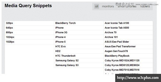
/*URL:http://html5boilerplate.com/*//* Smartphones (portrait and landscape) ----------- */@media only screenand (min-width : 320px)and (max-width : 480px) {/* Styles */}/* Smartphones (landscape) ----------- */@media only screenand (min-width : 321px) {/* Styles */}/* Smartphones (portrait) ----------- */@media only screenand (max-width : 320px) {/* Styles */}/* iPads (portrait and landscape) ----------- */@media only screenand (min-width : 768px)and (max-width : 1024px) {/* Styles */}/* iPads (landscape) ----------- */@media only screenand (min-width : 768px)and (max-width : 1024px)and (orientation : landscape) {/* Styles */}/* iPads (portrait) ----------- */@media only screenand (min-width : 768px)and (max-width : 1024px)and (orientation : portrait) {/* Styles */}/* Desktops and laptops ----------- */@media only screenand (min-width : 1224px) {/* Styles */}/* Large screens ----------- */@media only screenand (min-width : 1824px) {/* Styles */}/* iPhone 4 ----------- */@mediaonly screen and (-webkit-min-device-pixel-ratio : 1.5),only screen and (min-device-pixel-ratio : 1.5) {/* Styles */}Bootstrap的Media Queries/*URL:http://twitter.github.com/bootstrap*//* Large desktop */@media (min-width: 1200px) { ... } /* Portrait tablet to landscape and desktop */@media (min-width: 768px) and (max-width: 979px) { ... } /* Landscape phone to portrait tablet */@media (max-width: 767px) { ... } /* Landscape phones and down */@media (max-width: 480px) { ... }Foundation的Media Queries/*URL:http://foundation.zurb.com/*//* We use this media query to add styles to any device that supports media queries */@media only screen { }/* Used to alter styles for screens at least 768px wide. This is where the grid changes. */@media only screen and (min-width: 768px) {}/* Used to alter styles for screens at least 1280px wide. */@media only screen and (min-width: 1280px) {}/* Used to alter styles for screens at least 1440px wide. */@media only screen and (min-width: 1440px) {}/* Apply styles to screens in landscape orientation */@media only screen and (orientation: landscape) {}/* Apply styles to screens in portrait orientation */@media only screen and (orientation: portrait) {}Skeleton的Media Queries/*URL:http://www.getskeleton.com*//* Smaller than standard 960 (devices and browsers) */@media only screen and (max-width: 959px) {}/* Tablet Portrait size to standard 960 (devices and browsers) */@media only screen and (min-width: 768px) and (max-width: 959px) {}/* All Mobile Sizes (devices and browser) */@media only screen and (max-width: 767px) {}/* Mobile Landscape Size to Tablet Portrait (devices and browsers) */@media only screen and (min-width: 480px) and (max-width: 767px) {}/* Mobile Portrait Size to Mobile Landscape Size (devices and browsers) */@media only screen and (max-width: 479px) {}FRAMELESS的Media Queries/*URL:http://framelessgrid.com/*/@media screen and (max-width: 16.875em){}@media screen and (min-width: 32.5em) and (max-width: 37.4375em),screen and (min-width: 45em) and (max-width: 56.9375em),screen and (min-width: 77.5em) and (max-width: 102.4375em),screen and (min-width: 135em){}@media screen and (min-width: 102.5em) and (max-width: 117.9375em),screen and (min-width: 150em){}@media screen and (min-width: 15em){}@media screen and (min-width: 30em){}@media screen and (min-width: 37.5em){}@media screen and (min-width: 57em){}@media screen and (min-width: 57em) and (max-width: 117.9375em){}@media screen and (min-width: 118em){}Susy的Media Queries/*URL:http://susy.oddbird.net/*/@media (min-width: 29em) {}@media (min-width: 30em) and (max-width: 60em) {}@media (min-width: 119em) {}@media (min-width: 33.75em) and (max-width: 67.5em) {}@media (min-width: 33.75em) and (max-width: 67.5em) {}Less Framework 4/*URL:http://lessframework.com/*/@media only screen and (min-width: 768px) and (max-width: 991px) {}/*Mobile Layout: 320px (20em).*/@media only screen and (max-width: 767px) {}/*Wide Mobile Layout: 480px (30em)*/@media only screen and (min-width: 480px) and (max-width: 767px) {}Golden Grid System的Media Queries/*URL:http://goldengridsystem.com/*//* @media screen and (min-width: 640px) */@media screen and (min-width: 40em) {}/* @media screen and (min-width: 720px) */@media screen and (min-width: 45em) {}/* @media screen and (min-width: 888px) */@media screen and (min-width: 55.5em) {}/* @media screen and (min-width: 984px) */@media screen and (min-width: 61.5em) {}/* @media screen and (min-width: 1200px) */@media screen and (min-width: 75em) {}/* @media screen and (min-width: 1392px) */@media screen and (min-width: 87em) {}/* @media screen and (min-width: 1680px) */@media screen and (min-width: 105em) {}/* @media screen and (min-width: 1872px) */@media screen and (min-width: 117em) {}/* @media screen and (min-width: 2080px) */@media screen and (min-width: 130em) {}Fluid baseline的Media Queries/*URL:http://fluidbaselinegrid.com/*//* MOBILE PORTRAIT */@media only screen and (min-width: 320px) {}/* MOBILE LANDSCAPE */@media only screen and (min-width: 480px) {}/* SMALL TABLET */@media only screen and (min-width: 600px) {}/* TABLET/NETBOOK */@media only screen and (min-width: 768px) {}/* LANDSCAPE TABLET/NETBOOK/LAPTOP */@media only screen and (min-width: 1024px) {}@media only screen and (min-width: 1280px) {}/* WIDESCREEN *//* Increased body size for legibility */@media only screen and (min-width: 1400px) {}320andUP/*URL:http://stuffandnonsense.co.uk/projects/320andup*/@media only screen and (min-width: 480px) { /* 480 */}@media only screen and (min-width: 600px) { /* 600 */}@media only screen and (min-width: 768px) { /* 768*/}@media only screen and (min-width: 992px) { /* 992*/}@media only screen and (min-width: 1382px) { /* 1382 */ }@media only screen and (-webkit-min-device-pixel-ratio: 1.5), only screen and (min--moz-device-pixel-ratio: 1.5), only screen and (min-device-pixel-ratio: 1.5) { /* 2x*/}Gridless/* URL:http://thatcoolguy.github.com/gridless-boilerplate/ */@media only screen and (min-width: 480px) {/* Wide mobile (480px+) styles go here */}@media only screen and (min-width: 768px) { /* Tablets/netbooks (768px+) styles go here */}@media only screen and (min-width: 1024px) { /* Desktops (1024px+) styles go here */}TotanTHEMES/*URL:http://titanthemes.com/*//* Smaller than standard 960 (devices and browsers) */@media only screen and (max-width: 959px) {}/* Tablet Portrait size to standard 960 (devices and browsers) */@media only screen and (min-width: 768px) and (max-width: 989px) {}/* All Mobile Sizes (devices and browser) */@media only screen and (max-width: 767px) {}/* Mobile Landscape Size to Tablet Portrait (devices and browsers) */@media only screen and (min-width: 480px) and (max-width: 767px) {}/* Mobile Portrait Size to Mobile Landscape Size (devices and browsers) */@media only screen and (max-width: 479px) {}Responsive Grid System/*URL:http://responsive.gs/*/ @media (max-width: 480px) {} @media (min-width: 480px) and (max-width: 768px) {} @media (min-width: 768px) {} @media (min-width: 1024px) {} @media (min-width: 1200px) {}本文搜集的是Media Queries在各种设备下的代码片段,希望这些片段能帮大家更好的理解Responsive断点的设置。如果大家有更好的方案,希望能在评论中分享。
2014年04月19日更新基于视窗宽度的媒体查询断点设置前提设置body的字体为100%。其具有一个简单的计算公式:100% = 16px = 1em = 14pt
/*Viewport = 1920px*/@media screen and (max-width: 120em){}/*Viewport = 1680px*/@media screen and (max-width: 105em){}/*Viewport = 1400px*/@media screen and (max-width: 87.5em){}/*Viewport = 1200px*/@media screen and (max-width: 75em){}/*Viewport = 1024px*/@media screen and (max-width: 64em){}/*Viewport = 960px*/@media screen and (max-width: 60em){}/*Viewport = 800px*/@media screen and (max-width : 50em){}/*Viewport = 768px*/@media screen and (max-width : 48em){}/*Viewport = 600px*/@media screen and (max-width: 37.5em){}/*Viewport = 480px*/@media screen and (max-width: 30em){}/*Viewport = 320px*/@media screen and (max-width: 20em){}/*Viewport = 240px*/@media screen and (max-width: 15em){}/*High Resolution/Retina Display Media Queries*//*Pixel Density 3*/@media(-webkit-min-device-pixel-ratio: 3),(min-resolution: 192dpi){}/*Pixel Density 2*/@media(-webkit-min-device-pixel-ratio: 2),(min-resolution: 192dpi){}/*Pixel Density 1.5*/@media(-webkit-min-device-pixel-ratio: 1.5),(min-resolution: 124.8dpi){}/*Pixel Density 1.25*/@media(-webkit-min-device-pixel-ratio: 1.25),(min-resolution: 120dpi){}/*Printed Style Media Queries*//*Print Resolution 300 dpi*/@media print and (min-resolution: 300dpi){}/*Print Resolution 144 dpi*/@media print and (min-resolution:144dpi){}/*Print Resolution 96 dpi*/@media print and (min-resolution:96dpi){}/*Print Resolution 72 dpi*/@media print and (resolution:72dpi){}
来源:https://www.tulaoshi.com/n/20160217/1577010.html
看过《CSS3实例教程:详解Media Queries片段》的人还看了以下文章 更多>>


