下面这个怎样评估网站用户体验设计教程由图老师小编精心推荐选出,过程简单易学超容易上手,喜欢就要赶紧get起来哦!
【 tulaoshi.com - 平面设计 】
如果说内容占据食物链的顶端,那为什么我们还要花大量时间在在讨论更好的设计上?每一天,我们都在辩论、试验和商讨关于美学、增强功能和布局之类的话题上,却甚少谈及内容。然而,我们得承认当下是内容为王,但是,这并不意味着设计就此贬值了。
It may seem logical that the user experience lives and dies by how the user relates on an emotional level to the content on a website. But this is not necessarily the case. From a design perspective, our job is to maximize the value of every visitor, whether they love the content or hate it. The role of a UX designer is not always to make everyone feel all warm and fuzzy inside. A rich Web experience could include the emotion of happiness, humor, discontent, sadness, anger or enlightenment. A well-designed website enables us to attribute our emotion to its source and connect us to that environment through a range of senses. A UX designer should understand why and how to utilize the principles and techniques they have learned to support the website’s precious content.
用户体验的生杀大权由用户对网站的情感深浅决定,这似乎挺合理。但其实不然。从设计角度来说,我们的任务是最大化每个访问者的价值,不管他们对内容是爱还是恨。用户体验设计师的作用,不仅仅是让每个人感觉温馨舒适。一个丰富的网络体验应该包括幸福、幽默、不满、悲伤、愤怒和顿悟等情感。一个精心设计的网站能够让我们的情感回归本源,并且感同身受。用户体验设计师应该要知道为何要和如何去利用他们学到的准则和技巧来支撑网站的宝贵内容。
(本文来源于图老师网站,更多请访问https://www.tulaoshi.com/pmsj/)
Justifying User Experience Design
评估用户体验设计
(本文来源于图老师网站,更多请访问https://www.tulaoshi.com/pmsj/)
Investing in UX design as an amplifier of good content is not always an easy process. In many industries, a product that fills a demand and that works as it should is good enough. Most of us don’t care how an ink pen or a computer monitor makes us feel, as long as it works. A large portion of the Web still reflects this sentiment, as do clients and project managers who haven’t been educated in the value of UX.
把用户体验设计当作优质内容的扩大器来投资可不是一个容易的过程。在很多行业,只要产品能够满足某个需求并且正常工作就算不错了。我们很多人都不关心一支墨水笔或一个电脑显示器给我们的感觉,只要它能用就够了。网络上很多地方都能反映出这种观点,就是因为客户和项目经理们还没有认识到用户体验的价值。
(本文来源于图老师网站,更多请访问https://www.tulaoshi.com/pmsj/)
A website is a much more involved product than an ink pen and calls for a different measurement of user satisfaction. A product that merely meets demand and works correctly does not suit a medium that is so highly interactive and saturated. As designers, our task sometimes is to convince other parties of the value of building a user’s personal engagement with the website’s content. Fortunately, we have examples of companies that have done UX right and that have the success to show for it.
网站是一个比墨水笔复杂得多的产品,在用户满意度上,它需要一个不同的衡量标准。它还仅仅是一个满足需求且工作正常的产品,还不配作一个高度交互和渗透的媒介。作为设计师,我们的任务有时候就是要说服其他人认识到让用户参与网站内容的价值。幸运的是,我们有这样的例子,一些公司做了很好的用户体验,它们的成功足以说明其价值。
(本文来源于图老师网站,更多请访问https://www.tulaoshi.com/pmsj/)
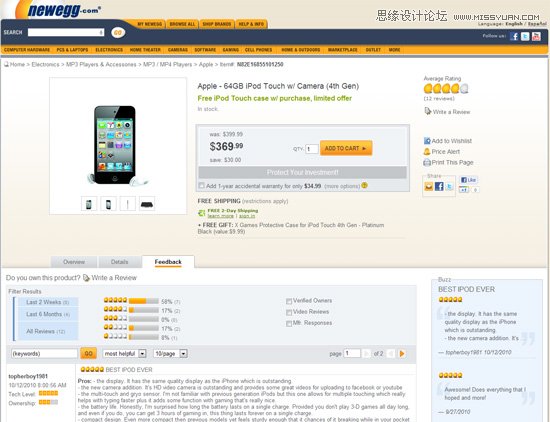
As a geek who enjoys building computers, I look to Newegg as a good example of a company that has played to its strengths to deliver a superior user experience. In its early days, Newegg’s fair prices and lightning-fast delivery of computer components made it the place to shop for IT people. This was all great, but the real kicker was that users who loved to share product strengths and weaknesses with each other could do it all on Newegg’s website.
作为一个喜欢组装电脑的极客,我认为新蛋网是致力于传递优秀的用户体验的公司中一个很好的代表。早期,新蛋网凭借合理的价格和闪电般的发货速度,成为了IT人士购买电脑元件的常去之地。做到这样已经很不错了,但是更令人惊喜的是,用户完全能够在新蛋网上分享产品优点和缺陷。
(本文来源于图老师网站,更多请访问https://www.tulaoshi.com/pmsj/)
This turned out to be a fantastic benefit for new users, who were inclined to trust the experience and suggestions of people they regarded as peers. As a result, Newegg built a massive army of geeks who generated content and provided an extremely valuable experience to its users. If you had a device or component that was functioning oddly or not at all, chances are that someone had shared the cause and maybe even a solution in a Newegg review.
这个功能对于新用户来说特有帮助,因为他们更倾向于相信朋辈们的经验和建议。结果,新蛋网建立了一支由极客组成的庞大队伍,由他们产生内容并提供超有用的经验给用户。如果你的设备或元件运行有问题或不工作了,去新蛋网看看吧,可能有人已经在上面分享了故障原因,甚至已给出解决方案了。
(本文来源于图老师网站,更多请访问https://www.tulaoshi.com/pmsj/)
Newegg acted on this opportunity the right way by using design to highlight its most valuable content. While its design may not be the slickest or most modern, Newegg provides a great experience and has high user satisfaction. Ratings and reviews by peers have become a driving force in Newegg’s design and populate nearly every page. As the design has evolved over the years, product reviews have floated to the surface of nearly every page, and the system for contributing reviews has grown in depth and functionality as well. Newegg even took this to the next level with a recent nationwide ad campaign and design. All of this came about because Newegg identified which of its content made for a strong user experience and built on it, which should be done in every Web project.
新蛋网很正确地利用了这次机会:通过设计来突显其最有价值的内容。或许它的设计不是最巧妙最现代的,但是新蛋网提供了一种卓越的体验,并因此得到了很高的用户满意度。朋辈们的排名和评论已经成了新蛋网设计的驱动力,几乎每个页面都能看到。随着该设计多年的优化,产品评论出现在了几乎每个页面上,评论系统也在深度和功能上得到了发展。通过一轮全国性的广告竞赛和新的设计,新蛋网又将更上一层楼。所有这些的出现,都是因为新蛋网知道哪些内容有助于提高用户体验,并且加以强化,哪些形式是该推广到每个项目中去的。
(本文来源于图老师网站,更多请访问https://www.tulaoshi.com/pmsj/)
Identifying the content that makes you stand out is only the first piece of this puzzle. What we really want to explore is how to take everything we have learned about color theory, lines, shapes and visual movement and apply it to our content in a way that doesn’t just decorate it or even make it pop on the page, but rather that supports the conversion of a goal or delivery of a message. Much like how the primary function of petals on a flower is to attract insects to pollinate, good design ensures that your website will thrive. All of that great design talent needs to be applied not only to the content but to the layer before and after it as well.
找出让网站脱颖而出的内容只是解决问题的第一步。我们真正要做的,是如何把我们学到的色彩理论、线条、形状和视觉传达等知识应用到内容上,不仅仅是装饰它或者突显它,而是要能达到一个目的,传递一种信息。就像花瓣的主要作用是吸引昆虫授粉一样,好的设计能够促使网站壮大。优秀的设计,不仅要用在内容上,也要用在布局的方方面面。
(本文来源于图老师网站,更多请访问https://www.tulaoshi.com/pmsj/)
The Delicious Design Sandwich
设计:可口的三明治
(本文来源于图老师网站,更多请访问https://www.tulaoshi.com/pmsj/)
With virtually every website, good UX design can be sectioned into three parts or events: introduction, consumption and reaction. Content is at the core, the meat of what the user is looking for, and on both sides of the content are events that are driven by a well-executed design.
基本在每个网站上,好的用户体验设计都可以分为三个部分:初识、消费和反馈。内容是核心,就像三明治里的肉,而两边夹着的,是精心设计的各种项目。
(本文来源于图老师网站,更多请访问https://www.tulaoshi.com/pmsj/)
User Introduction
用户初识
(本文来源于图老师网站,更多请访问https://www.tulaoshi.com/pmsj/)
The Web is a world of first impressions, and quick ones at that. Users form an opinion of a website within the first few seconds of loading it. This means that the colors, the layout and the presentation of headings are all evaluated before any content is actually absorbed. Users are inclined to scan content until they zero in on something that piques their interest. Regardless of what your content actually says, the design around it controls what the users see first and how their eyes move across the sections of the page.
网络世界注重第一印象,优秀者都精于此道。用户对一个网站的印象,在其加载的几秒间就已形成。也就是说,颜色、布局和标题的展现方式,在内容被认可前就已被评估。用户都是先浏览内容,直到找到感兴趣的,他们才会仔细阅读。不管具体内容是什么,都是其设计决定用户先看到什么以及如何在页面的各个版块间移动。
(本文来源于图老师网站,更多请访问https://www.tulaoshi.com/pmsj/)
In addition to searching for interesting information, users will also be determining how credible this resource is. Despite being constantly taught that we shouldn’t judge a book by its cover, all of us are susceptible to trusting a resource based on our familiarity with it, what our peers think of it and the time and money that we estimate was put into its construction.
在寻找有趣信息的同时,用户也会确定该站点的可信度。尽管我们一直被教导不要以封面来评判一本书,但所有人都会受到的如下三个因素的影响:我们对其熟悉程度、朋辈们的看法和对其建设所耗时间与金钱的估算。
(本文来源于图老师网站,更多请访问https://www.tulaoshi.com/pmsj/)
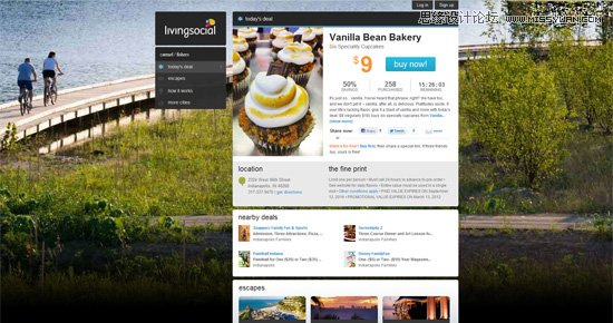
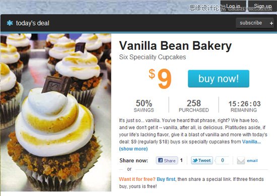
Living Social takes advantage of this in its design in multiple ways. A quick scan of the main page after the user has entered an email address and location reveals several techniques that have been implemented to elicit a reaction from the user.
团购网站Living Social将此用到了其设计的诸多方面。选择位置和输入电邮后,在主页随意浏览,就能发现几个精心设计用以引起用户共鸣的地方。
(本文来源于图老师网站,更多请访问https://www.tulaoshi.com/pmsj/)
Perhaps most striking is the background image. In every city that Living Social serves, a background picture loads that the visitor can relate to. I immediately connected with this website because I did a double-take at the background image and realized that I pass by this area all the time: it’s just down the road from me!
最震撼的可能就是背景图片了。在Living Social提供服务的每个城市里,都有一张用户能够联想到的背景图。当我后知后觉发现那张图里的地方,就在不远处,我每天都经过时,我一下子觉得这个网站亲切了许多。
(本文来源于图老师网站,更多请访问https://www.tulaoshi.com/pmsj/)
Living Social has also done the little things right. A clear hierarchy is established on the page through the headings and content modules; the call to action is the most prominent element; and the interactions oriented around engagement are easily accessible. The counters that tell you how many people have bought the deal and how much time you have left generate sufficient peer pressure.
Living Social也同样注重细节。从标题到内容,整个页面都有很清晰的层次结构;购买按钮是最醒目的元素;其他的交互元素也触手可及。计数器在告知购买者数量和剩余时间的同时,也会让你觉得压力不小。
(本文来源于图老师网站,更多请访问https://www.tulaoshi.com/pmsj/)
(本文来源于图老师网站,更多请访问https://www.tulaoshi.com/pmsj/)
When all is said and done, Living Social has invested in the introduction side of its design, which makes a lot of sense given its content. Living Social and the other daily deal websites thrive on a high volume of quick visits, which means they often live and die on first impressions. The heavy emphasis on the impression portion of this design begins with the content. Instead of fitting content into a design concept, Living Social has wrapped an appropriate design around the content that it wants to feature. But we aren’t done there.
能做的都做了之后,Living Social也就完成了初识部分的设计投资,这些对于内容来说意义非凡。Living Social以及其他的团购网站都是靠高访问量发展的,也就是说它们的生死存亡取决于用户的第一印象。在印象方面的设计,是为了突出内容。Living Social为其想要突显的内容量身定制了一套设计,而不是将其硬生生地塞入到某个设计理念中去。但这远不是终点。
(本文来源于图老师网站,更多请访问https://www.tulaoshi.com/pmsj/)
Content Consumption
内容消费
(本文来源于图老师网站,更多请访问https://www.tulaoshi.com/pmsj/)
Even in the process of consuming content that we’ve proposed, design plays a huge role. The crucial rules of typography control the experience that users have when reading articles. The mood of images and video can vary drastically based on their aesthetic setting. If your primary content is user-generated, then the ability of users to interact with the website and each other will be driven by the interface you’ve designed.
(本文来源于图老师网站,更多请访问https://www.tulaoshi.com/pmsj/)
即使在消费推荐内容的过程中,设计仍然起着重大作用。排版方式控制着用户的阅读体验。同样的图片和视频,不同的美学设计,给人的感觉会大不相同。如果你的内容主要是由用户产生,那么用户与用户,用户与与网站之间的互动能力都要取决于你设计的界面。
(本文来源于图老师网站,更多请访问https://www.tulaoshi.com/pmsj/)
More than anything else, content is an opportunity to set the tone of the website. We have all witnessed the untold damage that is done when content that should have a professional tone is set in Comic Sans. The font face, size and color can do an amazing job of controlling how your website says something that leaves an impression on users, which leads to the final piece of our sandwich. Along these lines, the way you frame entire portions of the website gives the audience clues as to what their emotional reaction should be.
内容比其他一切更能奠定一个网站的基调。本是专业的内容,用的却是Comic Sans字体,这样的悲剧我们见过太多了。在网站如何展现重点内容以便给用户留下深刻的印象方面,字体、大小和颜色起着超乎想象的作用,它们会引导用户到三明治的最后一块。遵循这些准则,你对整个网站的构架会给用户一些线索,暗示他们应该有怎样的情绪反应。
(本文来源于图老师网站,更多请访问https://www.tulaoshi.com/pmsj/)
We see this naturally develop with websites created by designers for their own peers. Portfolios, design-related apps, and websites for networks and conferences are all designed for tone. Of course, getting too extravagant in an attempt to impress is the opposite of what we are trying to achieve here. However, in the case of a conference about HTML and CSS, a website that experiments with the edges of what’s possible with HTML and CSS is an appropriate setting for the content.
我们看到这种设计方法正在设计师为朋辈们设计的网站中发展。个人信息,设计相关的应用,网络和会议类网站都是依基调而建。当然,不能过度地表明意图,那样只会适得其反。也有例外,在做一个有关HTML和CSS的会议的项目时,网站用最先进的HTML和CSS技术来展现内容是可取的。

(本文来源于图老师网站,更多请访问https://www.tulaoshi.com/pmsj/)
Like many websites for technology and design conferences, The Combine in Bloomington, Indiana, is highly design-driven. In addition to the slick HTML and CSS that will resonate with the professionals being targeted, the aesthetics intentionally reflect the small-town atmosphere of Bloomington. The same features that distinguish the location of this conference also encourage users to identify with the design.
就像很多科技和设计会议的网站一样,印第安纳州布卢明顿市的The Combine网站充满了设计感。除了使用精巧的HTML和CSS来引起专业人士的共鸣外,还特意使用了反映布卢明顿小城镇风貌的插画。既表明了会议地点,也易于用户识别。
(本文来源于图老师网站,更多请访问https://www.tulaoshi.com/pmsj/)
用户反馈
(本文来源于图老师网站,更多请访问https://www.tulaoshi.com/pmsj/)
(本文来源于图老师网站,更多请访问https://www.tulaoshi.com/pmsj/)
(本文来源于图老师网站,更多请访问https://www.tulaoshi.com/pmsj/)
This may be the most understated design-driven activity on a website, but it carries huge value. How the user responds to your content is pivotal to the website’s success. These days, merely delivering content is not enough. The Web has a wealth of information and options. In order for a website to enjoy any success, it must take advantage of referrals, links and maybe a bit of buzz on social networks. If we want to stand out on the Web, our users need to share our content with friends or contribute their own thoughts, reactions and content.
这或许是网站中认知度最高的设计行为,其价值巨大。用户对内容作何反应,对于网站的成功是至关重要的。现如今,仅仅传播内容是不够的。网络上有成千上万的信息供选择。网站要想成功,必须就必须利用转发、链接甚至是在社交网络上制造舆论。如果网站想脱颖而出,就需要用户与朋友分享我们的内容,或者贡献他们的想法、反馈和内容。
(本文来源于图老师网站,更多请访问https://www.tulaoshi.com/pmsj/)
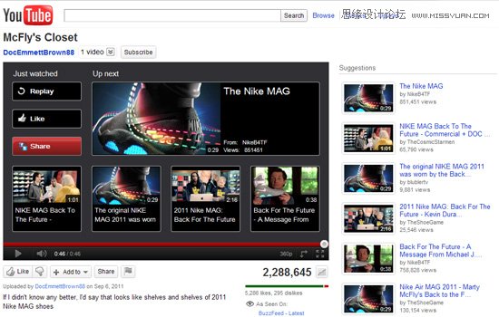
YouTube serves as a practical example of building an experience around the user’s reaction. YouTube kickstarted the concept of viral videos, but getting there required that the website be designed around the content itself. We all know that a massive amount of content is uploaded to YouTube every day, but the degree to which a video goes viral depends on how encouraged the user feels and how easily they are able to share or contribute to the experience.
在以用户共鸣来构造体验方面,YouTube的例子很具操作性。YouTube创造了病毒视频的概念,但是要想达到预期效果,网站就必须根据内容做设计。我们都知道,每天都有无数的视频传到YouTube,但是每段视频的传播程度,都要看用户受激励的程度,以及传播此体验的难易程度。
(本文来源于图老师网站,更多请访问https://www.tulaoshi.com/pmsj/)
It doesn’t take a trained eye to see this in action all over any given YouTube page. Suggested and related videos are always available, along with the option to share a video on your favorite social network or embed it anywhere on the Web. Of course, the design was not made to look good on its own and then this functionality shoehorned in. Again, the emphasis is on the content, and the design elements that result in the user’s reaction are all rooted in sharing or exploring that content.
正常人都能在YouTube的页面上看到这些设计:从不缺少的推荐视频和相关视频,还有把视频分享到各类社交网站或者是嵌入到其他网站的选项。当然,这些设计可不是金玉其外败絮其中的货。再强调下,内容是重中之重,引起用户共鸣的设计元素都是为分享或发现更多内容而作。
(本文来源于图老师网站,更多请访问https://www.tulaoshi.com/pmsj/)
In a world driven by likes, tags, tweets, shares and votes, the follow-through that a website and its content facilitates becomes a massive factor in its success or failure. A user who visits a website, views the content and then leaves generates little value for the business. For this reason, we see blog articles sprinkled and even littered with related content, suggested videos that come up after you watch a clip, and quick and easy share and save buttons everywhere. The follow-through on each of these actions is highly design-driven. The color, shape, size and location of links and buttons determine whether a visitor sees them quickly or not. But, of course, we can’t expect everyone to play the role that we define for them
在一个由喜欢、标签、推文、分享和投票驱动的世界里,网站内容的跟进是其成功或失败的一个重要因素。看完内容然后离开的用户,在这方面产生不了丁点价值。为此,在很多博客里我们都会看到这些情形:有意或无意放置的相关内容、看完一段视频后准有推荐视频,随处可见的分享和保存的按钮。所有的这些行为都是经过精心设计的。链接和按钮的颜色、形状、尺寸及位置,决定了用户能否一眼就看到。但是,不是所有人都会扮演我们为其设定的角色。
(本文来源于图老师网站,更多请访问https://www.tulaoshi.com/pmsj/)
Designing For An Experience
为体验而设计
(本文来源于图老师网站,更多请访问https://www.tulaoshi.com/pmsj/)
As important a role as design plays in the perception of and reaction to your content, people still argue that a user experience cannot truly be designed. Of course, the user ultimately decides how they engage with any design. If the goal of a design is to convert every single user into a customer, then failure is the only outcome. We can, however, design an experience that connects immediately with a target audience, delivers information with a clear tone and purpose, and encourages a response.
尽管在用户对内容的感知和共鸣上,设计扮演着重要的角色,但仍有争议说用户体验是不能被设计出来的。没错,只有用户自己能决定是否对设计买账。如果设计的目的是为了把每一个用户都转化为客户,那么失败是必然的。但是,我们是可以设计这样的体验的:与目标受众紧密相联、用清晰的色调和明确的目的来传递信息,最后鼓励用户给出反馈。
(本文来源于图老师网站,更多请访问https://www.tulaoshi.com/pmsj/)
We want to design an experience for users who are willing to buy into it. Users come to your website most likely because they already have some interest in digging into the content, which means they are willing to play into the experience that you have designed. If a user stumbles on the website by mistake, then taking them all the way to the reaction stage of the experience becomes more of a bonus than a goal.
我们想为那些买账的用户设计体验。既然用户愿意来你的网站,他们很可能已经对内容感兴趣了,也就是说他们愿意融入到你设计的体验中去。如果一个用户是误闯进来的,那么把他们带到体验的反馈阶段更像是一种额外奖励而不是目标。
(本文来源于图老师网站,更多请访问https://www.tulaoshi.com/pmsj/)
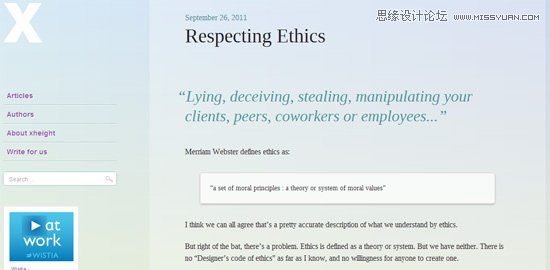
Different techniques for driving engagement with content can be found across the Web. If you’ve been to the blog xheight lately, you may have noticed its effort to prioritize the content in its posts. In addition to the minimalist design, the designer further isolates the content by fading elements out of view after your cursor has been idle for a few moments, leaving the article you are reading as the only element on the page.
网上有各种各样的推动用户参与内容的方法。如果你最近去过博客网站xheight,可能就会发现他们为优先显示内容所做的努力。除了极简的设计外,设计师还用了其他方法来凸显内容。如果鼠标闲置一段时间,其他元素就会隐藏,页面上仅剩下你正在看的内容。(译者注:仅支持chrome浏览器。)
(本文来源于图老师网站,更多请访问https://www.tulaoshi.com/pmsj/)

(本文来源于图老师网站,更多请访问https://www.tulaoshi.com/pmsj/)
(本文来源于图老师网站,更多请访问https://www.tulaoshi.com/pmsj/)
(本文来源于图老师网站,更多请访问https://www.tulaoshi.com/pmsj/)
The jury is still out on whether this makes for a better or more distracting reading experience, but this design decision clearly centers on the content that the designer wants to deliver.
(本文来源于图老师网站,更多请访问https://www.tulaoshi.com/pmsj/)
尽管关于此法是提高阅读体验还是分散注意力的争论仍在持续,但是这么做的目的很明显是要凸显设计者想要传播的内容。
(本文来源于图老师网站,更多请访问https://www.tulaoshi.com/pmsj/)
A different technique is apparent on the Livestrong website. When the user hits the browser’s address bar or tries to click away after reading an article, a modal window with related content pops up. It’s interesting that the modal window is enabled only in the blog section of Livestrong, and not by mistake. With a website this rich in content and from so recognizable a brand, the designers could assume that the majority of traffic to these articles would come from search engines. The goal here is to keep users from jumping back to Google for more content and to have them continue engaging with the content here.
Livestrong网站很明显用了另一种技巧。当用户看完一篇文章,点击浏览器的地址栏或者其他地方想离开时,就会弹出一个满是相关内容的窗口。有趣的是,这个弹窗只放置在博文里,但并不是误放的。设计师知道,像这样一个有着丰富内容和响亮品牌的网站,文章的大多数访问量都来自搜索引擎。他们的目标就是不让访客再跑回Google去搜其他内容,而是持续地参与内容。
(本文来源于图老师网站,更多请访问https://www.tulaoshi.com/pmsj/)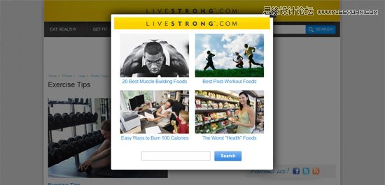
(本文来源于图老师网站,更多请访问https://www.tulaoshi.com/pmsj/)
(本文来源于图老师网站,更多请访问https://www.tulaoshi.com/pmsj/)
(本文来源于图老师网站,更多请访问https://www.tulaoshi.com/pmsj/)
(本文来源于图老师网站,更多请访问https://www.tulaoshi.com/pmsj/)
Editor’s note: The Live Strong site no longer has this feature since it seems to have been modified right before we published this article.
编者注:貌似自我们发布本文后,LiveStrong网站就把这个功能取消了。
(本文来源于图老师网站,更多请访问https://www.tulaoshi.com/pmsj/)
Keep Designing
生命不息,设计不止
(本文来源于图老师网站,更多请访问https://www.tulaoshi.com/pmsj/)
Now as much as ever, companies are recognizing the value that good design and a solid user experience can bring to them. UX design is about developing a road map for the user, encouraging certain actions, and developing a user base that wants to engage with your content.
现如今,很多公司已经意识到,好的设计和坚实的用户体验有很大价值。用户体验设计就是为用户设计路线图,鼓励某种行为和建立一个参与内容的用户库。
(本文来源于图老师网站,更多请访问https://www.tulaoshi.com/pmsj/)
The key to driving this engagement is to ensure that we value design in the right way, not simply as a template, theme or color scheme but as a support system for key content. We can use design to make a website unique and more memorable. We do this by laying the foundation of a good impression, enabling smooth and meaningful consumption, and encouraging engagement with the content. All three of these areas are opportunities to drive a user experience that is in harmony with our content.
推动这种参与的关键,在于确保我们有正确的设计价值观,设计不是简单的模板,主题或配色,而是对关键内容的一个支撑系统。我们能用设计使一个网站独一无二且更易记住。我们可通过如下三个方法达到目的:留下好印象奠定基础,推动无障碍且有意义的内容消费,鼓励用户参与内容。这三个部分都是传递用户体验的机会。
来源:https://www.tulaoshi.com/n/20160217/1577745.html
看过《怎样评估网站用户体验设计》的人还看了以下文章 更多>>