有一种朋友不在生活里,却在生命力;有一种陪伴不在身边,却在心间。图老师即在大家的生活中又在身边。这么贴心的服务你感受到了吗?话不多说下面就和大家分享20个布局独特的网站吧。
【 tulaoshi.com - 平面设计 】
Popmatik – Freelance web designer Rob Leach uses a unique layout for his portfolio site. The site uses a background image of a bottle and the content of the site appears to be on the label of the bottle.

Digitalmash.com – Digital Mash is the home of Australian web designer Rob Morris. What makes the layout unique is the background image of Rob holding the content of the page.

Melissahie.com – A portfolio site with a different twist, MelissaHie.com leads the visitor through a series of different sections of one page that include links to websites in a portfolio, a brief bio, and contact information. As you click on links, you will slide to a different section of the page.

Evanescenceuk.co.uk – The British website of American rock band Evanescence uses a horizontal layout and a navigational scheme similar to MelissaHie.com, where the visitor slides across the site when using the navigation rather than being taken to a separate page.

Sitotis.hr - The background image for Sitotis is a binder that contains the content of the page. Tabs in the binder are used for navigation.

Mussatto.com.br – Mussatto uses a long, horizontal layout that doesn’t require vertical scrolling as opposed to the standard, tall layout.
(本文来源于图老师网站,更多请访问http://www.tulaoshi.com/pmsj/)
Basil Gloo – Web Developer Basil Gloo uses an interesting layout on his homepage that separates the page into a left and a right side. The left side contains his personal information and the right side his business information.

Danviv.net – The portfolio site of Dan Viveiros uses a unique layout and several images of cassette tapes.

CraigEarl.co.uk – Photographer Craig Earl uses a layout that features four tall and narrow images that link to different categories of photos in his portfolio: everyday, landscapes, bands, and people.

JeremyCowart.com – Another interesting photography portfolio site, JeremyCowart.com places all of the emphasis on the pictures by taking you straight to the photos in the portfolio. Rather than making you click a few links to get to the photos, they are right there, one on top of the other. What’s most unique is that to get to any content other than photos you can visit the contact, news, and project links.

Huge – This design company uses a large image on the left side of the homepage with the primary navigation and content in a narrow column on the right.

Interview Magazine – Another horizontal layout, Interview Magazine presents a different visual impression than other online magazines.

The Horizontal Way – As a gallery of horizontal websites, The Horizontal Way naturally uses a horizontal layout itself.

Swiths.com – This website uses a large background image of a wood floor and a guy’s feet. The content of the site is on a piece of paper and a notepad laying on the floor.

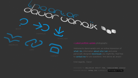
Davor van Eijk – The homepage of Davor van Eijk places navigation in the center of the page on an angle. The content of the page is in the lower right hand corner.
Ribbit.com – This layout features a large background image of a man sitting on the grass. The sky in the picture becomes the background of the page. The picture and how it interacts with the layout is really what give the page a unique feel.

BootB – This site uses a black background and some drawn clouds at the top of the page. The center of the page contains navigation in a circle that is part of an image of a hot air balloon that is about to float to the clouds.

Vesess – Vesess uses a simple header that includes navigation and then goes into an image right at the focal point of the page. If you scroll down you will see the use of a few columns for some basic information. While it is maybe not as different as many of the sites on this list it is still a break from the norm.

Dinulovic.com – The Dinulovic homepage contains no real content. It uses an image at the center of the layout with navigation on both sides.

StoryAbout.net – The homepage of Hansol Huh’s portfolio site uses a large image that says Life is Random in dots. Below the image is a link to the portfolio.

文章出处:20个布局独特的网站
来源:http://www.tulaoshi.com/n/20160220/1646570.html


