今天天气好晴朗处处好风光,好天气好开始,图老师又来和大家分享啦。下面给大家推荐31张设计精美的可视化数据信息图欣赏,希望大家看完后也有个好心情,快快行动吧!
【 tulaoshi.com - 平面设计 】
可视化数据信息图是将一些复杂的数据以图形化形式展示出来,信息图的视觉呈现要求很高的,如果设计不好,还不如直接看Excel表格了。所以设计可视化信息图是非常考验设计师们的能力。
如果没有设计过信息图的同学,建议还是多看点别人的作品,今天设计达人网整理了31张来自Dribbble上的设计精美的可视化数据信息图,我想这些一定能给你带来创作灵感,Enjoy!

How a camera is made
(本文来源于图老师网站,更多请访问http://www.tulaoshi.com/pmsj/)
Greenpeace toilet paper Infograpic

Timeline of mobile releases

How your iPhone is made

Subway infographic design elements + grid system
Infographics about $
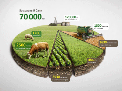
Infographic Agro Chart Illustration

In-app Visual Data

Infographic Postcard

Mixpanel analytics Infographics Graph

Olympic Dominance

Infographic Poster

Lumia1020

MOJO Stats

More Trees

Taxonomy Infographic

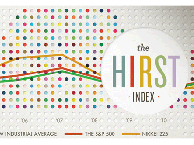
Info

Radar Chart Wireframe

More Wireframe Ideas

MagnaGlobal Ad Markets Map

Vintage Infographic Kit

Undisclosed Project

Infographic #WIP

The Definitive Guide to Growth Hacking

Flight Details

Infographics 4 (Buoys)

Map with detail

Nike Maps

Human Activity Information Design

Stream

World Map
来源:http://www.tulaoshi.com/n/20160216/1573201.html
看过《31张设计精美的可视化数据信息图欣赏》的人还看了以下文章 更多>>


